


You have already settled the practical questions. You know the required height and material, and the quantity fits your floor plan. The final question is simple: what colour bar stools should I get?
The answer should come from three filters, not a long list of fashionable colours. Your brand palette, counter colour, and room size will narrow the options quickly. At Cafe Solutions, we recommend choosing colour for a commercial reason and an aesthetic one.
Use this bar stool colour guide to make the call, then browse our commercial bar stools by colour. Review our guides to choosing bar stools and selecting the correct height before ordering.
Key Takeaways
- Start with your brand palette, bench colour, and room size.
- Match one fixed element and contrast another, rather than matching everything.
- Use one accent colour consistently instead of combining several unrelated colours.
- Black and dark grey are the most forgiving options for busy food-service venues.
- White and strong colours suit venues where presentation forms part of the customer experience.
- Limit mixed-colour stool schemes to two colours with the same finish.
Answer three Questions Before You Choose a Colour
Before asking, “What colour bar stools should I get?” answer these three questions. Each one removes unsuitable options and makes the final comparison easier.
What is your brand’s primary colour palette?
A defined brand palette gives you a starting point. Your stools can repeat one recognised brand colour or deliberately contrast it, but they should not introduce a competing palette without a reason.
For example, a venue with forest-green signage could use green bar stools to reinforce that identity. It could also use black stools and keep green in the menus, signage, and packaging. Both approaches work because the relationship is clear.
Without a set palette, begin with fixed finishes you are unlikely to replace soon, including the counter, floor, walls, and major joinery.
What colour is your bench, counter, or table surface?
The counter and stool sit besides each other all day, so this is the most important colour relationship in the room. A light timber bench usually benefits from black, charcoal, or another darker stool because the contrast defines the seating line.
A black stone counter can feel heavy when paired with bulky black seating. White, grey, timber-look, or coloured stools can break up that visual weight. Exact matching can work, but the finish needs enough variation to stop the stools from disappearing into the counter.
When you ask what colour bar stools I should get, compare samples directly against the counter. Colour can look different besides warm timber, cool stone, or stainless steel.
How large is the space?
Light colours make stools feel less visually dominant, which can help a small cafe or narrow bar area feel more open. White, pale grey, and selected coloured plastic stools can keep the seating line from looking too dense.
Dark stools anchor a large room and make a long counter feel deliberate. Black works particularly well where the ceiling is high, the floor plan is open, or the bar needs stronger definition.
A small venue can still use black stools when the frames are slim, and the counter provides contrast.
What Colour Bar Stools Should I Get? Follow these Five Rules
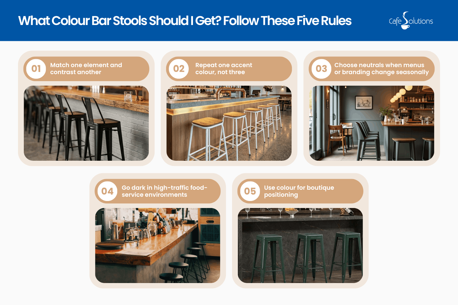
Choosing a bar stool colour becomes much easier when the decision is based on a few practical rules. Instead of matching every surface or chasing a short-term trend, focus on contrast, brand consistency, maintenance, and the role the stools play in the venue.
The five rules below provide a clear framework for narrowing the options. Each one addresses a common commercial concern, from busy food-service conditions to creating a stronger boutique identity.
Rule 1: Match one element and contrast another
Do not try to match the stools to the counter, floor, wall, pendants, and logo at the same time. Choose one connection and one contrast.
A light timber counter with black bar stools creates a clear outline while repeating black window frames or menu boards. A dark counter with a charcoal polypropylene seat can create a softer tonal result without looking identical.
The stool frame might match black lighting while the seat contrasts with a pale counter. That gives the colour choice a visible purpose.
Rule 2: Repeat one accent colour, not three
A single repeated accent looks intentional. Three unrelated stool colours often look like leftover stock or an unfinished decision.
Use red bar stools when red already appears in the branding, tiled details, or signage. Use green bar stools when they connect to the logo, planting scheme, or wall finish. The repeated colour does not need to appear everywhere, but customers should see the connection.
One consistent colour gives the bar area a clear identity and makes replacement orders easier later.
Rule 3: Choose neutrals when menus or branding change seasonally
Black, white, and grey stools can survive new menus, packaging, artwork, and seasonal displays. A strong colour may become difficult to work around after a rebrand.
White bar stools suit smaller or presentation-led venues where staff can maintain them regularly. Black is safer for high turnover, while grey provides a practical middle ground when white feels too stark.
If promotional colours change throughout the year, keep expensive furniture neutral. Let menus, table accessories, and window graphics carry temporary colour.
Rule 4: Go dark in high-traffic food-service environments
Black hides almost everything. Crumbs, minor marks, small scuffs and general cleaning wear remain less obvious than they would on white or a bright colour.
That makes black stools the safest commercial choice for busy cafes, food courts, pubs, and quick-service venues. Dark grey offers a similar advantage with a slightly softer appearance.
A forgiving colour reduces visible wear between cleaning rounds and keeps seating consistent during peak service.
Rule 5: Use colour for boutique positioning
Strong colours work best when the venue’s interior forms part of the product. Speciality coffee bars, wine bars, dessert venues, and small concept cafes can use seating colour to establish a recognisable point of view.
Deep green bar stools can support a botanical, premium, or produce-focused identity. Red bar stools can create energy and suit retro, diner-inspired, or high-impact concepts. Yellow, orange, pink, and blue can also work when the brand already supports them.
Use a strong colour because it communicates something specific about the venue, not because the room feels unfinished.
When Mixing Stool Colours Works
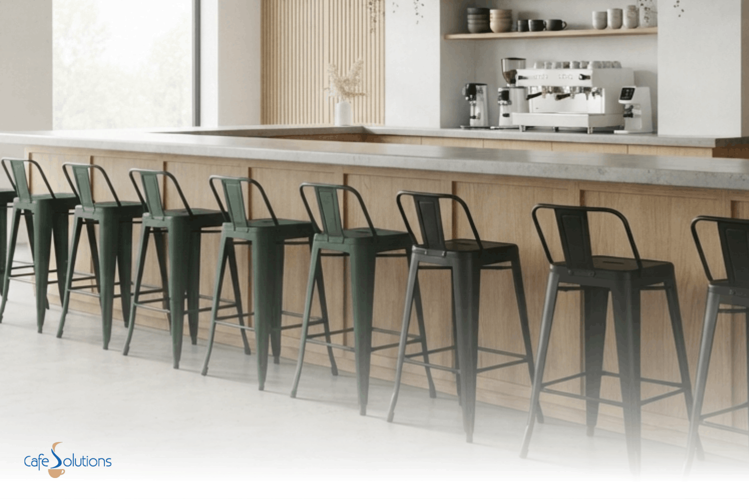
Mixing colours can work, but only under two conditions. First, the stools should share the same finish, such as two matte powder-coated colours or two matching polypropylene finishes. Second, the scheme should stop at two colours.
Black and white can divide a long counter into zones. Green and black can repeat a brand palette. Two muted tones can also work in a casual venue when the model, height, and finish remain identical.
Avoid mixing colour, material, shape, and height at the same time. Our guide on mixing and matching bar stools covers the wider layout considerations.
Explore Our Complete Bar Stool Range
How Material Affects the Way Colour Reads
Colour never appears separately from material. The same red can feel industrial on powder-coated steel, casual on polypropylene, and premium on upholstery.
Metal bar stools give colour a stronger, sharper edge. Black metal suits industrial and high-traffic venues, while coloured metal creates a confident statement that works well against timber, brick, and concrete.
Plastic and polypropylene make bright colours feel lighter and more relaxed. Plastic bar stools suit casual cafes and venues needing easy-to-move, easy-clean furniture.
Upholstered colours feel softer and more premium. Deep green, burgundy, navy, and tan suits wine bars and restaurants where customers stay longer, but cleaning requirements should guide the colours.
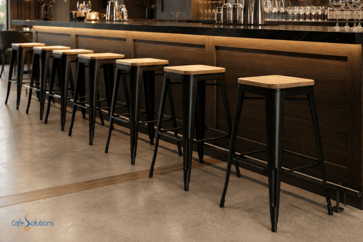
Timber changes colour through grain and undertone. A black frame with a timber seat can connect dark hardware to a warm bench without making the stool look completely black.
The Maintenance Reality of Bar Stool Colours
The best colour bar stools for a cafe are not always the strongest-looking examples. Commercial use exposes furniture to food, drinks, cleaning products, sunlight, and frequent movement.
White shows stains
White shows coffee, sauce, fingerprints, and gradual discolouration quickly. It can look excellent in a clean, controlled venue, but it needs regular wiping and prompt attention to spills. Choose white for lower-traffic areas, strict cleaning routines, or compact rooms that benefit from lighter furniture. Avoid it besides messy service zones.
Red can fade in direct sun
Red attracts attention, but extended UV exposure can reduce its intensity over time. This matters for stools placed outdoors or besides windows with strong afternoon sun.
Check that the product and finish suit the location. Shade outdoor furniture where practical to help maintain consistent colour.
Black hides almost everything
Black remains the most forgiving commercial colour. It disguises stains, scuffs, and day-to-day wear better than lighter options, and it integrates easily with future signage or interior updates. Black can still show dust and scratches on glossy finishes. Matte and textured surfaces tend to look consistent for longer.
Grey is the middle ground
Grey shows less than white but more than black. It suits venues that want a neutral base without the strong visual weight of an all-black seating line. Warm grey works well with timber and cream finishes. Cooler charcoal works with stone, stainless steel, and black joinery. Compare the undertone against the counter before ordering multiple units.
Make Your Final Colour Decision
If you still find yourself asking what colour bar stools I should get, return to the three filters. Choose a colour that relates to your brand, creates a clear relationship with the counter, and carries the right visual weight for the room.
Test that decision against maintenance. Colour only works commercially when your team can keep it consistent through normal service.
Browse the Cafe Solutions range of commercial bar stools, including black, white, red, and green options. You can also contact our team for help in narrowing the range to a colour, finish, and model that suits your venue.
FAQs on What Colour Bar Stools Should You Get?
What bar stools are in style now?
Current commercial choices favour simple forms, matte finishes, warm neutrals, dark green, deep red, and timber-and-metal combinations. The stronger long-term choice still connects to your permanent counter, floor, and branding.
Should bar stools be lighter or darker than the table?
Bar stools should usually contrast enough with the table or counter to remain visually distinct. Dark stools define a light surface, while light- or coloured stools can stop a dark counter from feeling too heavy.
Are wooden or metal bar stools better?
Metal bar stools suit high-traffic venues because they are strong, easy to clean, and available in consistent finishes. Timber brings warmth to natural or traditional interiors. Our guide to the types of commercial bar stools explains the wider options.
What is the bar stool trend for 2026?
The useful 2026 direction is confident simplicity. Buyers are using one clear stool colour, matte finishes, warm natural materials, and controlled two-colour schemes rather than combining several unrelated colours.
What does “counter stool” mean?
A counter stool is shorter than a standard bar stool and is designed for a lower counter or cafe bench. Counter stools commonly suit surfaces around 900 mm high, while taller bar stools suit higher commercial bars. Read our guide to bar stools and counter stools before ordering.
Back to Top: What Colour Bar Stools Should You Get? A Cafe & Bar Buyer’s Guide